
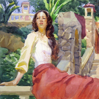
The objectives of Color and Composition will be twofold: to offer a comprehensive foundation in the fundamental …
$299.00
Course Access
Unlimited Duration
Total Video Time
20 hours, 57 minutes
The objectives of Color and Composition will be twofold: to offer a comprehensive foundation in the fundamental interactions of colors and how we perceive them, as well as present and explore aspects of visual composition through understanding basic visual components and the expressions important to visual communication. Models or assignments will be set up to display a specific color theory which will be explored in two compositional variations. This class will interpret theory through practical applications designed to help students both see and experience color theories and functional aspects of image making directly from life to close the gap between theory and application.
BIO: Bill Perkins has worked in animation as a layout artist and art director for over 30 years. Bill first became a layout lead on Rescuers Down Under and continues to work on a string of hits including; The Little Mermaid, Beauty and the Beast, Aladdin, Space Jam, Shrek, Bolt, Winnie the Pooh, Tangled, and Frozen.
Bill Perkins
About Instructor
Bill Perkins has worked in animation as a layout artist and art director for over 30 years. Bill first became a layout lead on Rescuers Down Under and continues to work on a string of hits including; The Little Mermaid, Beauty and the Beast, Aladdin, Space Jam, Shrek, Bolt, Winnie the Pooh, Tangled, and Frozen.
Course Curriculum
-
- Color and Composition | Preview FREE 00:05:00
- Preview for Color and Composition with Bill Perkins.
-
- Color and Composition: Overview 00:22:00
- Welcome to Color & Composition with Bill Perkins. Bill gives a quick overview of the ten week class and covers topics such as tone, line, and matrix. He explains the matrix, the basic shell of a painting, breaking down the painting into only black and white to see more clearly how the painting fits together. He defines the matrix, mass, and explains the notan.
- Tonal Value Demo 00:27:00
- Tone or value is the lightness and darkness of an area. Bill paints a black and white portrait based on notan, the flat light or ambient conditions that dominate the composition.
- The Simple Masses 00:22:00
- Begin with the process of blocking-in the simple value masses in a painting. See the differences between soft and hard edges and how they can help create depth.
- Color and Composition: Changes in Value 00:13:00
- Give life to the figure by painting subtle changes of value. Bill demonstrates the falloff of light and how to roll form.
- Color and Composition: Student Critique 1 00:06:00
- Students are critiqued to help with their value and contrast.
- Expanding the Value Range 00:21:00
- Bill builds up the value range as he starts to focus on the highlights in the facial area. Add to the darker areas to help create more contrast.
- Color Composition: Light and Dark Accents 00:15:00
- Add to the lighter planes of the face area to help create round edges and add dark accents to finish the image.
- Notan vs Chiaroscuro 00:16:00
- Understanding the difference between notan and chiaroscuro and how these two concepts can be combined. Major and minor tonal keys can be used to create mood in a painting.
- Color and Composition: Shadow Shapes 00:23:00
- Emphasize form by determining how strong the falloff of light is on the model. Create strong tonal contrast between the light and shadow areas. Find the large shadow shapes to block in the painting.
- Laying in the Darks 00:27:00
- Redefine the shapes of the figure and background by committing to the dark areas. Use the model's form to direct the eye and create a compelling image.
- Color and Composition: Directing the Eye 00:21:00
- Direct the eye and develop the form by adding to the lighter areas.
- Small Contrast Marks 00:19:00
- Control the focus of the eye. Continue to adjust and refine the values.
- Lightening the Planes 00:18:00
- Work on lightening the planes perpendicular to the light source on the figure to develop form. Work on the material in the background and foreground.
- Contrast of Saturation 00:15:00
- Color and the perceptual challenges of seeing contrast of saturation. The secret to tonal relationships reveals that the most contrast is shown in medium values.
- Color and Composition: Color Painting Demo 00:28:00
- Here Bill demonstrates the shift colors have relative to surrounding color. Bill brings in color to the palette for a portrait of a man in an orange shirt with a grey scarf.
- Color and Composition: Clear Matrix 00:10:00
- A strong matrix will always hold a picture together. The design of the shadow spaces is discussed during the block-in.
- Dark Side of Matrix 00:17:00
- Shifting the color temperature while working with a narrow value range. A strong light set-up can create multiple light sources within a shadow area depending on reflective surfaces.
- Color and Composition: Student Critique 2 00:03:00
- Individual student critiques are made offering tips and ideas to help develop their paintings.
- Light Side of Matrix 00:22:00
- Bill works on the lighter side of the painting while discussing temperature and saturation of color.
- Color and Composition: Adjusting the Shapes 00:31:00
- Finish the demo by adding planes and creating transitions. Bill demonstrates the different effects of saturation under low and medium key lighting setups.
- Design and Composition 00:16:00
- The abstract foundational elements of design and composition. The visual components of building a composition are reinforced in creating unity.
- Still Life in Charcoal 00:27:00
- A still life in charcoal is set up to show the process of identifying visual components. A charcoal drawing will be done as an exercise in beginning a composition.
- Abstract Design Theme 00:24:00
- The abstract design is developed with rhythm and unity. Dark and light tones are added to turn form and draw the eye to the focus of the composition.
- Color and Composition: Painting the Still Life 00:24:00
- Warm and cool versions of the primary colors are used to build the palette. The canvas is broken up into thirds to help determine the focal areas of the painting.
- Color and Composition: Dark and Light 00:17:00
- The values are adjusted to indicate the strong light source. A variation of neutral and saturated colors are added in the darker areas to help create transitions and depth.
- Color and Composition: Edges and Highlights 00:20:00
- Shifting values and temperature give depth to the painting. Highlights and edges are adjusted to bring the painting to a more finished look.
- Building Color Schemes 00:18:00
- The difference between analogous and complementary color schemes is explained. Bill demonstrates how a colored light will influence a complimentary color in the shadow of a still life.
- Complementary Scheme 00:24:00
- A full palette is used for a still life with a strong direct light with a colored gel on it. The wash underpainting will be done with the shadow colors before the basic design is blocked-in.
- Color and Composition: Dark and Light Values 00:28:00
- The darkest values are added before the light values are. Forms are created by making the areas perpendicular to the light the most saturated.
- Color and Composition: Light Values and Edges 00:26:00
- The forms develop as light values are added and edges are adjusted.
- Color and Composition: Finishing the Painting 4 00:21:00
- Value and highlights are refined and adjusted to bring the painting to a finish.
- Complementary Color 00:13:00
- Examples of complementary color schemes are presented in notan and chiaroscuro situations. A model is set up with a red light on one side, and green light on the other to show the effect of complementary colors.
- Complementary Color Portrait 00:23:00
- Bill works on a white canvas to keep the colors vibrant. Color notes are sketched in before the dark background is blocked-in.
- Color and Composition: Color Harmony 00:24:00
- The combination of colored lights with the local skin color produces a unique purple in this scheme.The challenge of maintaining color harmony is discussed when working with an extreme setup.
- Color and Composition: A Different Approach 00:22:00
- A second approach is begun with a green wash over the canvas. The setup for the model remains the same and the challenges of maintaining vibrant colors are addressed with this application.
- Color and Composition: Vibration 00:18:00
- Bill discusses the perceptual vibration effect that intense complementary colors can have. The influence of the underpainting is shown to affect the intense color that is layered over it.
- Color and Composition: Finishing the Painting 6 00:17:00
- Light planes are added to help develop form and mid-tones are adjusted to finish the painting.
